Japanese Design Archive Survey
DESIGN ARCHIVE
Designers & Creators
Kaoru Kasai
Graphic Designer, Art Director
Interview: 7 November 2022, 14:00-16:00
Location: Sun-Ad
Interviewee: Kaoru Kasai
Interviewers: Yasuko Seki, Tomoko Ishiguro, Keiko Kubota
Author: Tomoko Ishiguro
PROFILE
Profile
Kaoru Kasai
1949 Born in Sapporo, Hokkaido.
1968 Graduated from Hokkaido Muroran Sakae High School and moved to Tokyo to join Bunka Printing.
1970 Joined Ohtani Design.
1973 Joined Sun-Ad, currently an adviser to the company.
1977- Advertisement production mainly for Sony, Suntory Jyuhyo, Seibu Department Store, etc.
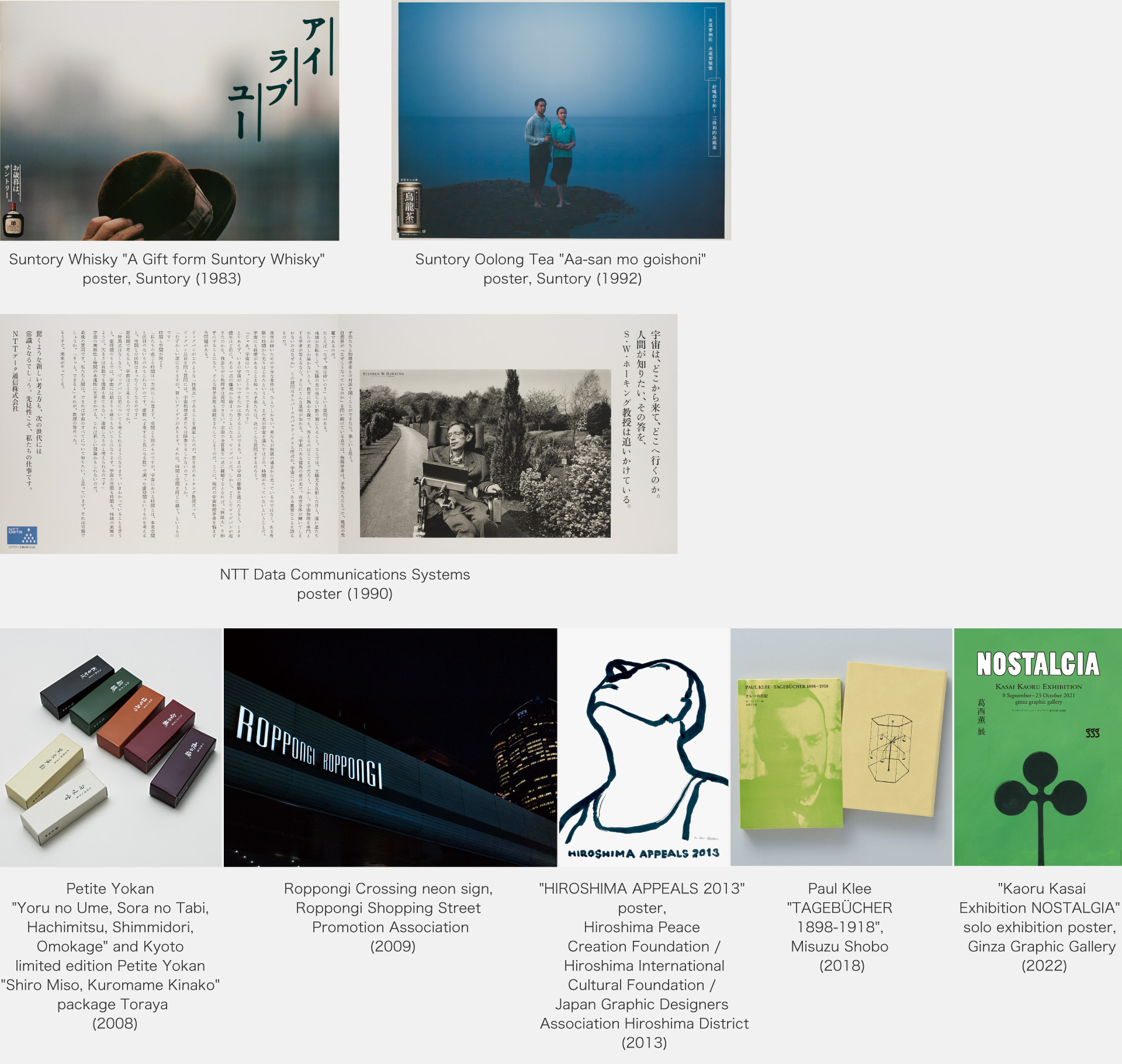
1982 Production of advertisements for "A Gift form Suntory Whisky" begins.
1983 Begins advertising production for Suntory Oolong Tea.
1984 Received ADC Award for Suntory "I Love You".
1986 Receives ADC's highest award for Suntory Malt's
1997 Begins advertising production for United Arrows.
1998 Awarded Mainichi Design Award for "advertising expression with refreshing emotion" for Suntory Oolong Tea, United Arrows, etc.
2003 Creative direction and package design for Kogen and Toraya begins.
2014 ADC Award Grand Prix and the 16th Yusaku Kamekura Award for the poster for the peace advocacy campaign "Hiroshima Appeals" (2013 edition)
2022 Solo exhibition "Kaoru Kasai PODTERS since 1973" CCGA Contemporary Graphic Art Centre
2023 Tokyo Advertising Association Shinobu Shirakawa Award
Description
Description
Kaoru Kasai has produced a series of works in both advertising and graphics that are neither bizarre nor vociferous, but deeply memorable. Masayoshi Nakajo describes his work as "flexible" and says: "Now is not the time when the accumulation of aesthetic senses becomes the power of expression. It is his time when intuition is the only way to persuade. He finishes that intuition with a delicate hand. It is not that he does not have a remarkable strategy, but his soft attack from many directions, without being strong, will one day reveal a strong form". He also paid a great compliment, saying, "It is our pleasure, despite his personality, that he was able to reexplore the lost human quality of kindness and make it a theme"*. Because of this, there is no end to the number of designers who have come to the door of Sun-Ad, to whom he belongs, in admiration of him.
His "flexibility" can also be seen in his path to success as a designer. Born in Hokkaido, he grew up surrounded by rich nature. He has loved working with his hands since childhood and learned lettering through correspondence courses when he was in high school, and dreamt of becoming a designer in the future. Due to family circumstances, he did not go on to university. However, his teacher recommended Tokyo as the place to work in design, and at the age of 19 he joined Bunka Printing in Tokyo. He worked on leaflets at work, looking out with an eagle eye so that he could spread his wings as a designer as soon as possible. His role was to make the printing block. Kasai says: 'I like the shortest distance. I was always thinking about what not to do", he recalls. He combines the ability to consider, analyse and conceive what needs to be done to achieve results in the shortest possible time with the ability to find new solutions, including the pursuit of techniques and rational processes. Neither sketching nor drawing were studied at school. While working, he developed his design skills more intensely and faster than he could have learnt at design school. 1970 he joined the Ohtani Design. There he trained in lettering and graphic design, and in 1973 he joined Sun-Ad, a company he had longed to work for. From there, he worked on long-term advertising projects such as Suntory Oolong Tea and United Arrows, directed Toraya (CI planning, space design and package design), worked on CI for Saison Group, Suntory and Roppongi, advertising art for films and theatre such as "Nobody Knows”, Tamotsu Fujii's photo collection "ESUMI"; book and artwork bookbinding, including Hitomi Kanehara's "Snakes and Earrings"; and many other memorable works.
Kasai says he has kept an archive of sketches for himself. The interview touched on the design of 'gentleness' as pointed out by Nakajo.
*From "Kaoru Kasai", Ginza Graphic Gallery (1998).
Masterpiece
Masterpiece
Advertisements and commercials
Sony Audio (1977 - 1992); "A Gift form Suntory Whisky" (1982 - 1990); Suntory "Oolong Tea"(1983 - 2007); Suntory "Malts" (1986 - 1992); Suntory "Sake wa naniyorimo tekiryo desu (proper amount of drink is just right)" (1986 - 2022); NTT Data Communications Systems (1990 - 1991); Seibu Department Store "Nihon ichi no ichi (best fair in Japan)" (1986-1992): United Arrows (1997- )
CI signage planning, packaging design, spatial planning, etc.
Tokyo Metropolitan Tsubasa Sogo Senior High School, wall graphics (2002); Suntory, Suntory Museum of Art Signage plan, new CI (2004-2007); Lake Suwa Museum, AKAHIKO Memorial Museum; Art direction for Toraya (Toraya Café, Toraya Kobo, Packaging, Toraya Tokyo Midtown, etc.; 2003-); Toranomon Towers CI and signage planning (2006); Roppongi Shopping Street Promotion Association Roppongi signage plan, new CI manual (2009)
Theatre, film title work and posters, video works, etc.
Hirokazu Kore-eda: "Maboroshi" (1995), "Nobody Knows" (2004), "Still Walking" (2008); Michio Koshikawa: "Life and Death on the Shore" (2017); Junji Sakamoto: "Okiku and the World" (2023), Ryo Iwamatsu:"Ukikumo" (1995), "Summer Hotel" (2001); Hiroshi Koike: "Island" (1997), "Heart of GOLD - 100 Years of Solitude" (2005), "Tokyo⇔ Buenos Aires Letters" (2007), "The Complete Mahabharata" (2021); Video production for NHK Minna no Uta "Crying Clown" (2013).
Binding, editorial
"Poetry Collection: Yosei no Shi", Xylo (1997); Shungiku Uchida "The Night He Cried", Kadokawa Shoten (1998); Haruki Murakami "Murakami Radio", Magazine House (2001); Hitomi Kanehara "Snakes and Earrings", Shueisha (2004); Hiroshi Homura "Zekkyo Iinkai", Chikuma Shobo (2010); Miwa Nishikawa "Eternal Excuse", Bungeishunju (2015); Ichiro Yamaguchi "Words Notes for My Own Training", Seidosha (2023).
Arata Isozaki "ARATA ISOZAKI", Rikuyosha (1992); Peter Zumtoer "Architektur Denken", Misuzu Shobo (2012); Paul Klee "Klee Diary," Misuzu Shobo (2018); "Mina Perhones / Minagawa Akira Tsuzuku", Seigensha Art Publishing (2020); Ryo Iwamatsu "Ryo Iwamatsu Plays 1986-1999", Little More (2022).
Tamotsu Fujii "ESUMI", Little More (1996); Kazumi Kurigami "NORTHERN", "April" Switch Publishing (2002/2020), Go Ayano and Kazumi Kurigami "Portrait", Gentosha (2023); Yoshihiko Ueda: "at Home", Little More (2006); Yoshiyuki Okuyama "As the Call, So the Echo", "flowers", Akaaka Art Publishing (2017/2021); Rika Noguchi "My Father's Album", Akaaka Art Publishing (2022).
Books
"Kaoru Kasai" Ginza Graphic Gallery (1998); "Kaoru Kasai's Work and Surroundings" Rikuyosha (2002); "Time Tunnel Series Vol.25 Kaoru Kasai 1968" Recruit (2007); "Kaoru Kasai 1968" ADP (2010).
Interview
Interview
It is not about making something new. There must be something that never gets old, I thought.
I keep an archive for myself
ー I saw "Kaoru Kasai 1968" (ADP), which was published in 2010. The first half of the book contains graphic work from the 1990s onwards, and the second half contains advertising work from 1968, when you moved to Tokyo from Hokkaido and joined Bunka Printing, so this book could be considered an archive in itself.
Kasai More than 10 years have passed since that book was published, but thanks to that, there are still people who buy it, for which I am grateful. The first half of the book is graphics, the second half is advertising, and the structure is exactly in between, with interviews in between to speak the language. I thought it would be more interesting to go back in time from the present to the past, and I was reading Kenichi Yamamoto's book "Ask This of Rikyu" (Rikyu ni Tazuneyo) at the time. I was convinced that this was it. Also, I did a lot of advertising work, but advertising is based on graphic design, and I thought it would be better to show the new work that I'm doing now, to give a sense of progression.
ー The book is full of sketches and other materials, which caught my attention. Some designers throw sketches and other materials away, but I understand that you have kept them instead of throwing them away.
Kasai I was involved as a member of the editorial committee with Kazunari Hattori for "NAKAJO", which was published by the same ADP in 2021. However, Masayoshi Nakajo was said to have been uninterested in things from the past, and he was not concerned about things like sketches, saying, "Just throw them away". I'm not very patient, so I tend to be reluctant to throw away things that have my footprints, or rather, traces of my hands on them. It's not so much that I keep them, it's more that I don't throw them away, but rather that they've accumulated and remained.
ー Are they like sketches of ideas?
Kasai In advertising and in other work, I get an idea under given conditions and first draw something on a white piece of paper. It can be a figure, a word, a sketch, etc. What I drew at the time became the source of the idea, and when I arrived at a certain form, I can look back later and remember that the paper was the 'prototype'. That kind of prototype becomes important to me. At the point when I draw it, I have a dichotomy in my mind between what should be kept and what can be discarded, so I make a rough decision there. Sometimes I cut out only the necessary parts from the notebook and discard the rest.
ー The prototypes are stocked and become an archive. Do you use a specific notebook when you draw?
Kasai It's not so splendid as an archive, but over 20 or 30 years, I have accumulated something like a sketchbook. I don't use a specific notebook, but at first I used a sketchbook given to me by the photographer Yoshihiko Ueda. At the time, Mr Ueda had a big black sketchbook he bought in the US with Polaroids on it, and when I told him how cool it looked, he bought it for me as a souvenir. From that point on, I started drawing my idea sketches and other sketches on a single notebook. That way they don't get scattered and I can look back on them from time to time. I was a bit nervous at first to start drawing because it was a magnificent sketchbook. It usually takes me a year to finish a book. Now I use the bundle samples and other things I've accumulated on hand when I'm doing binding work.
Advertisements that look like a drop of whisky
ー The advertisement for "Suntory Oolong Tea" was produced from 1983 for nearly 30 years. It started as an independent presentation by copywriter Takashi Ando to Suntory. The illustration series became a live-action series, and the commercials shot in China became a hot topic.
Kasai I remember going to China for the first time for this shoot and being impressed by many things. I was overwhelmed by the vastness of the land and the lives of the people living there. The things I saw around me, such as buckets and taps, were different from those in Japan, and also different from those in the West, which was really interesting. The kanji characters are also different, with men's toilets written as 'Otokokai' and women's toilets as 'Onnakai', which I thought was cool. It wasn't modern, but I felt like I saw a lot of different prototypes there. During the 10 days or so I was on location, I was sketching more and more, thinking, "I have to record this". That's when I consciously started drawing in my notebook. I copied, I wrote down shapes and words that came to me, without any context or meaning. I used to use old letter paper in hotels in China, which was chic and well-written. When I went on location abroad, I felt that I was spending precious time, so I also kept a diary during my business trips.
ー So it wasn't that you were consciously trying to preserve them as an archive?
Kasai It was more for my own sake than to show to anyone else. "Suntory Oolong Tea" and United Arrows, which I started in 1997, are mostly archived from the conception to the establishment of the brand. Especially with "Suntory Oolong Tea", I couldn't throw away everything from the planning documents given to me by the client, to the orientation sheets, to the ideas that I kept coming up with as they were lost, so I kept almost all of them. I thought it would be a good idea to show them to the public, so I filed them all together so that they could be viewed, and I even exhibited them at an exhibition.
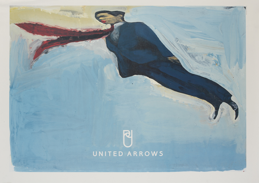
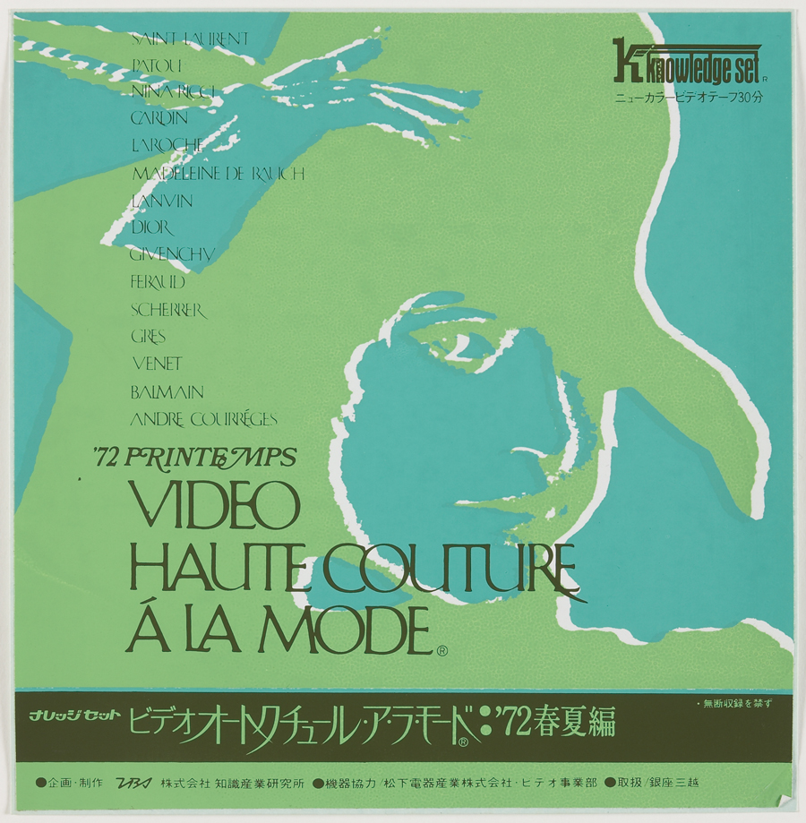
"UNUTED ARROWS" poster, United Arrows (1997). Italian painter Gianluigi Toccafondo was selected for the corporate image ads. The two also teamed up for the company's 30th anniversary advertisement in 2019.
ー "Suntory Oolong Tea" was a commercial with a fresh air and a sense of strength China 30 years ago was very different from today.
Kasai Back then, China seemed to me to have a wonderful future awaiting it. There was even a sense of what we expected from China and what we wanted it to be like. I think that series is a record of that.
ー I think a lot of people think that the worldview seen in "Suntory Oolong Tea" is an expression of Mr Kasai himself.
Kasai I think I discovered the core of my own way of expressing myself through China and the Chinese people. I am really glad I did it. At the time, I was taking on the challenge, thinking that I would never be able to continue for long, and that therefore the present was precious. When I realised that a quarter of a century had passed, I felt the weight of it all the more.
Yes, it is gratifying to be regarded as a masterpiece, but when I started working for Suntory, I longed for the adult world of whisky advertising, where light and darkness coexist. In other words, I wanted to create commercials that looked like a drop of whisky. Oolong tea is a female-centred drink, but I wanted to sneak in a man's world somewhere, or the feeling of being intoxicated by alcohol. We wanted the Oolong Tea commercials to be inspiring to people outside the client's real target audience.
ー Did you have an awareness at the time of production that you wanted to give people that kind of surprise?
Kasai I can't say that I didn't, but rather than trying to surprise the world, I was more interested in creating something good. I didn't want to use the word 'beauty' too much, but I wanted to be something like a basic prototype. In advertising, people are always trying to surprise you, so I don't think about that in reverse. There may have been a calculation that we would stand out more if we dared to be quiet in contrast. Beverages, daily necessities, etc., "Wow, it tastes good", "Shiny!" and "shiny!", etc., in commercials for beverages and daily necessities. I have always hated that kind of thing (laughs). That doesn't get my heart going. I thought it wouldn't. But I enjoyed thinking about it and coming up with ideas so that the world of expression would not be all one colour.
Fortunately, China has a thick history. Oolong tea is a drink born on an awesome land, so I think we managed to borrow the Chinese figure and were helped by what was behind it. During filming, we also visited mountainous areas instead of cities, which was a hard experience. But there was also an underlying sense of respect for China's long history, or rather, a sense that there must be something in the depths of Japanese history that has faced China, and that we should honour that history.
Starting out as a printmaker
ー Well, I would like to ask you about the starting point of how the designer Kaoru Kasai was born. It all started when you graduated from high school and moved from Hokkaido to Tokyo to join a printing company in Tokyo, didn't it?
Kasai I started learning lettering through correspondence courses when I was in high school, and I also made homemade albums. I was interested in design, but due to family circumstances I had given up university studies and was trying to find a job in Sapporo. When I told my teacher at a career advice session that I felt I could do a job related to letters, he immediately replied, "If you want to work in design, go to Tokyo". He then told me that a company called Bunka Printing in Tokyo had a job offer for us. They were planning to build a new company building and they happened to be recruiting. The company must have thought that if I was coming all the way from Hokkaido to join them, I wouldn't quit so easily.
After joining the company, I worked in a corner of the printing house, doing plate-making work. It was a live-in job for two people in a four-and-a-half-mat room. The work started at 7.30am with wiping the oil off the machines with a rag. The nails become black with ink and it takes 10 minutes to remove it with special soap. Design work was done with bare hands, as there were no trescope (magnifying machines) or photocopiers in those days, but it was fun. I learnt how to enlarge and reduce manuscripts quickly and efficiently by drawing diagonal lines on tracing paper to match the proportions. That's why I can still design when the power goes out. I never studied drawing either, but I learnt by observing the human figure. Then I realised that the human body is like a machine, all you have to do is look at the bones. It's not the outlines that are important, but the bones. I was told by the company to work with the intention of staying there for the rest of my life, but I was aware that this was only a temporary place, and I tried to look outside to find the next place to aim for.
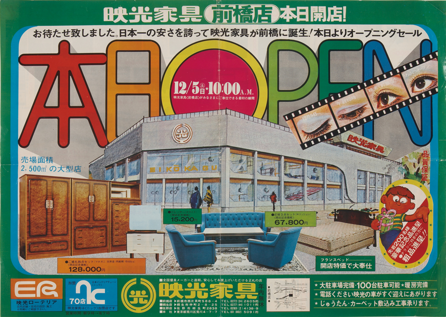
Eiko Kagu flyer (1969). The first four-colour printed leaflet done during the Bunka printing period. On the right, a brochure for the Institute of Knowledge Industry during the Ohtani Design Institute period (1972).
ー It's a surprising story that I can't imagine from your situation afterwards.
Kasai My curfew was 11pm, but after work I would go out and see plays at the live music club Shinjuku Pit Inn or the Jokyo Gekijo. Tokyo was the melting pot of the underground of anti-modernism - Tadanori Yokoo, Akira Uno, Shuji Terayama, Juro Karo... and I think I was influenced by them.
Bunka Printing printed small prints for the Seibu Department Store Shibuya, which opened in 1968. While I was making the block prints, I looked at the designs there and thought that the time had come for Seibu. One day, I heard that the Ohtani Design was working on designs for Seibu, found their vacancy and changed jobs. Moreover, Shiro Ohtani, a renowned lettering designer, was the president. In fact, the work I did there was not advertising, but mainly lettering and brush lettering titles for sales displays, but it was here that I began to do lettering and design work in earnest and was able to change from being a printmaker to a graphic designer. I started advertising when I was invited to apply for the Asahi Advertising Award by copywriter Yoshio Kuwahara, whom I met during my time at Bunka Printing. He told me about the wonderful advertisements created by the American advertising companies DDB and Young & Rubicam, and that turned me around and made me yearn to be an art director rather than a graphic designer. Our first application for the Asahi Advertising Award was unsuccessful, but we won the semi-Asahi Advertising Award in 1971. Mr Kuwahara took his work and went to Sun-Ad to sell it, and joined the company, while I saw an advertisement for Sun-Ad in 1973, took the entrance exam and joined the company. Looking back, my life was a series of coincidences, but I think it was good that I was always able to see one of the 'top' companies up close.
I want to be a craftsman who conveys the message properly
ー Mr Kasai's path is like a drama. You are also a man of great luck. That Sun-Ad was founded in 1964 by Ken Kaiko, Hitomi Yamaguchi and Ryohei Yanagihara, all of whom came from Suntory's advertising department. It has a long history, but how is the archive organised?
Kasai We have organised our stock as a proper archive and store it in our in-house warehouse. When Sun-Ad celebrated its 50th anniversary, we held a commemorative exhibition at Gallery 916. The year after next will be the 60th anniversary of the company's founding, so we will probably organise something else. When we celebrated our 38th anniversary, we compiled a book called "SUN-AD at work" (Advertising Conference, 2002), in which I played a central role. This was the catalyst for the organisation of the archives. We also have staff within the company who know the archives like a living dictionary. Recently, the website has also been enhanced. Suntory also requests us to organise and store Suntory's work as an archive, which is part of Sun-Ad's role.
When I joined Sun-Ad, there was a big scrapbook where the work of our senior staff was stored, which was very valuable and still remains. But the posters and other materials were kept in a balled-up state and were scattered around. So I took the initiative and gradually rearranged them by building shelves and changing the flow lines: we built shelves twice the size of B to store posters flat on top of each other, and we used boxes of photographic plate-making film to store newspaper advertisements. I've always liked thinking about these things. It's not about making it look good, it's about making it flow better.
I donate my main posters and other materials to the CCGA Centre for Contemporary Graphic Arts at DNP.
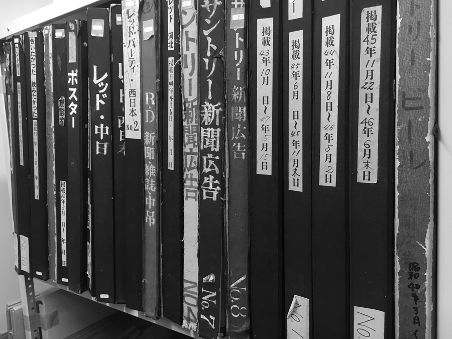
Sun-Ad archives stored in scrapbooks.
ー In the 1990s, you shifted your field of activity from advertising to graphics - was this a natural progression?
Kasai I found myself in the field of graphics, and now I'm working on about ten book covers at the same time. I also continue to illustrate Naoto Fukasawa's serials for "Elle Deco" magazine. When I was young, I guess I wanted to do something flashy in advertising. I was devoted to advertising, which is how I ended up at Sun-Ad, but while I was working in advertising, I also realised that advertising is a form of graphic design, so I realised anew that this side is interesting too, and gradually I realised that I didn't only want to work in advertising. Of course I still want to do advertising, it's interesting. But as I get older, I won't be allowed to work in advertising.
ー I was impressed by your comment in one of your interviews that "the job of advertising is to organise". What do you mean by organising?
Kasai I think of my job, as well as advertising, as a conduit, or rather a job that stands in between, to convey the work that someone else was trying to do to someone else. So I have to "communicate better than anyone else". I want to organise all kinds of information and explore what is easy for the viewer to see and understand. I want to be a craftsman in that sense. Individuality may be added later.
Even in everyday life, when I see things with ridiculous design, language or emphasis on odd points, I get really angry.I get irrationally angry at that kind of work. One example of this is when the packaging says 'remove the label from here', but I've never been able to remove it properly. I get irrationally angry at that kind of work. If you're going to get paid, you have to do a good job.
I have been like that since I was a child. I found it hard to understand the way exam questions were given, or the graphs in school statistics. I used to think things like, "If it were me, I would do it this way". I enjoyed and loved 'devising' everything.
ー Even as a child, you knew that there is a skill in communicating not only in writing, but also in the design arrangement.
Kasai Even before I started working in design, I may have subconsciously thought this way and accumulated it, and I became interested in how to make a single line of text easy to read, not too noisy and convey the words properly. It's not that I'm denying my individuality, but that's how I started. Originally, I wanted to be an engineer. I have always loved building models from scratch, as well as plastic models. I thought the instruction manuals and wiring diagrams for propeller-driven aeroplanes were lean, precise and well-made.
Engineers assemble them three-dimensionally, so they have to mobilise everything - space, mechanism, function, materials, durability, etc. I like thinking about such things.
Kasai style, the decisive factor in decision-making
ー We were able to get a glimpse of how your sensibility was nurtured. Advertising work is done as a team and is a series of choices, but I would like to ask you about the decisive factor in making decisions in difficult situations.
Kasai It is really difficult. There are so many forks in the road. But what is usually decisive for me is the impression I get when I look at it after some time. Even if I think it's good the moment it's finished, I often get bored of it when I look at it a few hours later. On the other hand, if I think something is good, even if it's not a great idea, I want to look at it again, and it becomes something that lasts a long time. Long-lasting means that it never gets old and feels fresh. That's why I tell myself, "Don't make something new. There must be something that never gets old", or something like that, to put my mind at ease. Also, in my case, the more work I put in, the more I put my heart into it, the longer it lasts. Things done in a flash tend to be forgotten quickly.
So I was always working right up to the limit. Sometimes I would be thinking and drawing ideas on a small piece of paper right up until just before a presentation, and it would go straight through. And don't rely on others. If I don't come up with the idea myself, I don't feel empowered. My driving force is to do what I want to do at all costs.
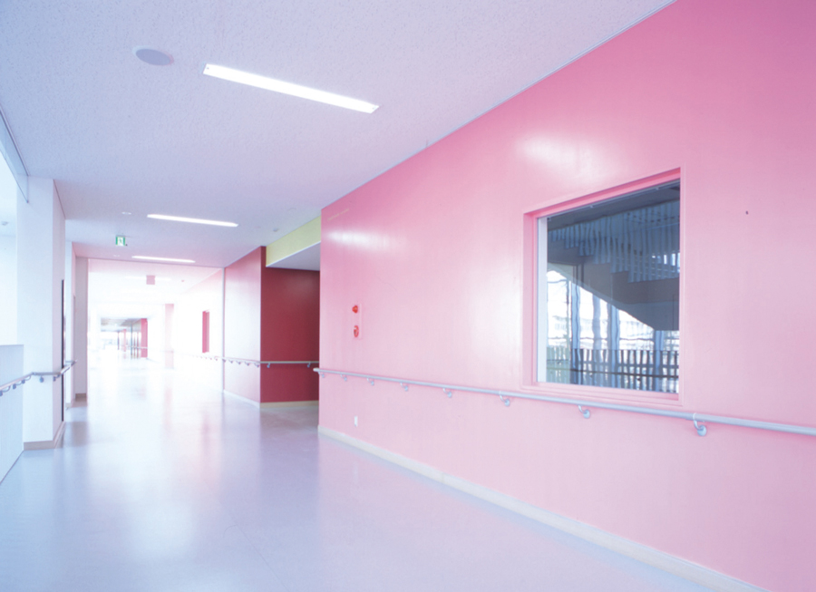
ー The 2002 wall graphic for the Tokyo Metropolitan Tsubasa Sogo Senior High School was one of three ideas that had not been decided on until just before the project was completed, according to the creative director, Koichi Ando of Ando Gallery. He said.
Kasai On the way to the high school on the day of the proposal, I asked Ando's office staff for her opinion and made a decision just before I arrived at the high school. The needle is always moving dizzily.
Another deciding factor when making a choice is to push me to the edge of a cliff. If I have a safe idea and a dangerous idea, I will take the plunge and choose the dangerous idea. Usually you want to choose the safe one, but I choose the thrilling idea because it brings a thrill to the scene and it's a breakthrough. The idea creates a sense of tension for everyone. I myself get fired up and think, 'I must make this good or I'll be disgraced'.
In the case of Suntory, we couldn't pass a safe idea. I was sometimes rebuked, saying, "Are you sure that's what you want?" They used to say, "We're not looking for something neat, we're looking for a hit". I think they read that we had been doing this for a long time and that if we asked this team to do it, they would make it "clean and pretty", so it was just as well that we asked for something very muddy. We sometimes had heated arguments. However, what I realise is that even if the content differs from the orientation, the work that is created with a sense of tension that transcends position is more likely to be a hit and become a commercial that moves the feelings of the other party.
ー The prototype you are talking about may be found in the boundary between the two. I felt this in the graphics of Tsubasa Sogo Senior High School. It's an idea that doesn't come from an architect.
Kasai I think you are right. Tsubasa Sogo Senior High School asked us to do graphic work on a flat wall, but we looked at the wall not as a flat surface, but as a mass. I even drew a blueprint from the side to see how it would look from below and from the side, and to what extent it would be considered a wall and the boundary of the coloured surfaces.
On stage, the viewer's mood changes depending on where the person speaking the dialogue is standing, doesn't it? The image changes depending on the distance between people, the way the dialogue is exchanged and how it is trimmed. Subconsciously, I look at these things.
There is no particular ideology there. Rather, I see even thought as a phenomenon. For example, a moment of peace is lost when war breaks out, and when something blows up, it is no longer peaceful in an instant. I feel that human beings are like standing on a balance beam, and if we step off it, we enter a different world, and we live our lives on a fine line. I didn't go to art college either, and I kept on thinking that one day design would be ruined. I've been living out of fear. So I'm afraid that if I don't do something that works, I'll lose it one day.
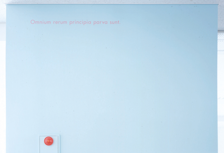
Tokyo Metropolitan Tsubasa Sogo High School Wall graphic 'Wisdom on Wall' (2002). The Latin saying 'The beginning of every story is small' (Cicero) is written on a light blue wall. The contrast between the text and the colour of the wall is stunning. The school building is intended to be a living teaching tool for architecture and art.
Connecting with the archetype that each of us has
ー It reminds me of the "Schrodinger's cat" thought experiment in quantum mechanics. This is a theory that states that the normal state of things cannot be determined until we observe them, and that they overlap with conflicting events, but it is important how we perceive the phenomena that are there.
Kasai I think it is a sense of valuing and recording what is happening only here and now. Nobody knows what will happen tomorrow. So even if I take a picture of an empty landscape, I can feel it as a precious moment, and I design my photographs with the belief that the people who receive them will feel the same way. That is the kind of thrill that lurks in the ordinary. Design and advertising want to put the thrill in the foreground, but it is more frightening and harrowing just before the 'thing' happens. A person who is about to start laughing is more interesting than a person who is laughing a lot, and a person who is about to start getting angry is more frightening than a person who is gabbing and shouting, because they are quieter. People can sense those things. So they should understand, so I don't want to show them too much. I expect people to feel it.
ー You have to be restrained. It takes courage to do that. What you have just mentioned reminds me of the Toraya direction you worked on, starting with the Toraya Café in 2003.
Kasai I worked on Toraya after I turned 50, and I was glad to have been commissioned to do it after I had passed my age. It is a Japanese confectioner with a 500-year history, founded in the late Muromachi period. I am forced to think about what not to do rather than what to do. I myself am not an expert in Japanese confectionery, and I had to make decisions from the perspective of a graphic designer, looking at it through the eyes of 'this is the kind of Toraya I want Toraya to be' and 'what is this like for Toraya? ' The graphic elements that Toraya had used until then had become disunified over the years, so I started by organising them. And since we have a fine tradition, we thought it would be better to be as appropriate to it as possible, and to keep the ornamentation as minimal and dexterous as possible.
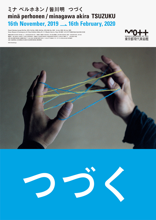
"Mina Perhonen/Akira Minagawa Tsuzuku" poster (2019), Museum of Contemporary Art Tokyo. Kasai was responsible for the overall graphics of the exhibition. The exhibition attracted a lot of attention and toured to three museums in Japan, and was also held in Taiwan.
ー In retrospect, advertising in Mr Kasai's time was rich. I feel that this richness has been lost nowadays.
Kasai Designers are tempted to design, but this often leads to disaster. Today, we don't even know what we like and what we don't like.There are many advertisements that show off how great something is, but I want to emphasise the importance of connecting with each individual's natural senses.
It's called mass communication, but it's about each and every one of us. The viewer, the creator and the client.
In order to get the message across to that "one person", I want to build up the minimum number of elements - sound, images, words, time, timing... to the extent that if I miss even one element, everything will fall apart. I think the less I talk too much, the more I can convey what I want to say.
ー The perfect balance between the two, which is not too intrusive, is probably the reason why it hasn't become old over time. And I feel that it is precisely in this day and age that the work of Mr Kasai is in demand. Thank you very much for your time today.
Enquiry:
Sun-Ad
https://sun-ad.co.jp
CCGA Centre for Contemporary Graphic Arts
https://www.dnpfcp.jp/gallery/ccga/
Home Archive Communication Education Exchange Proposal Research Company Membership Contact
Copyright © PLAT. All rights reserved